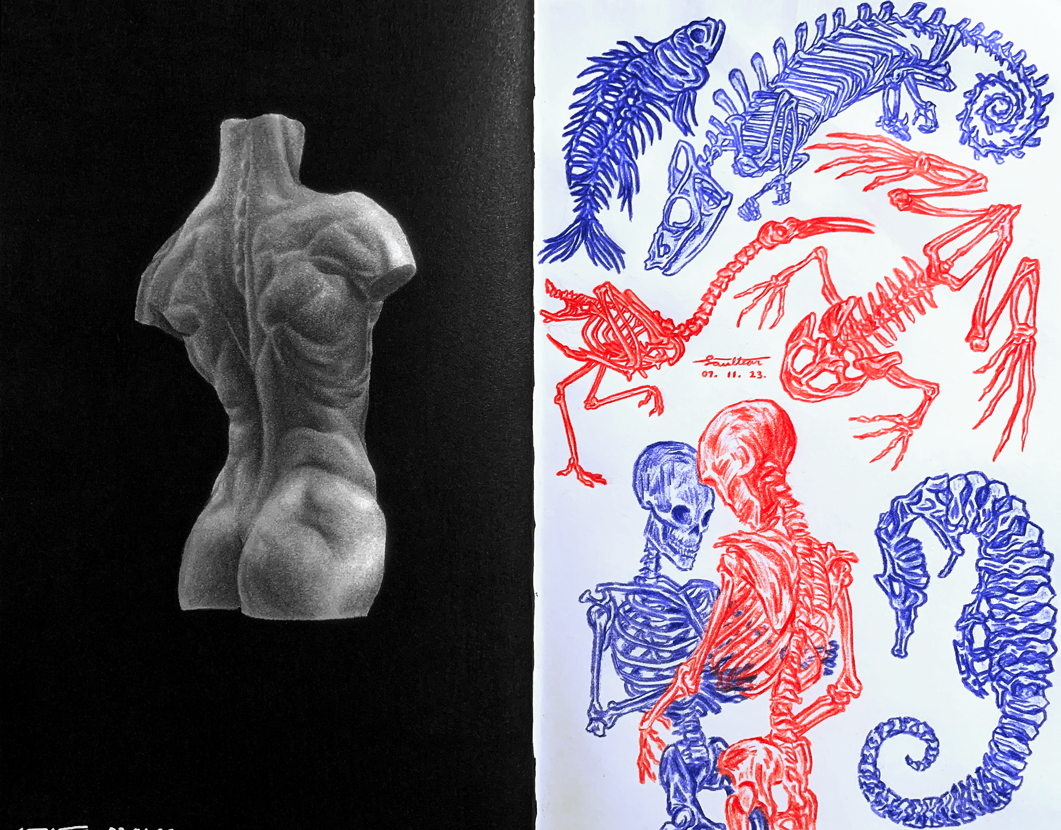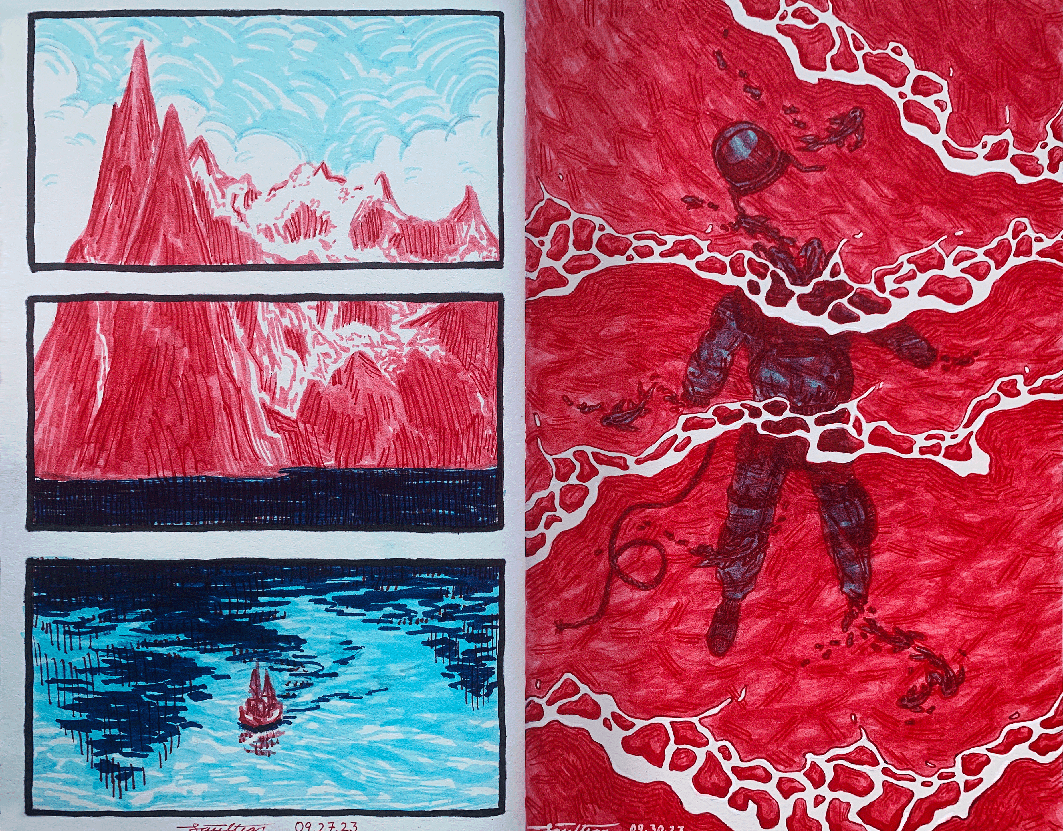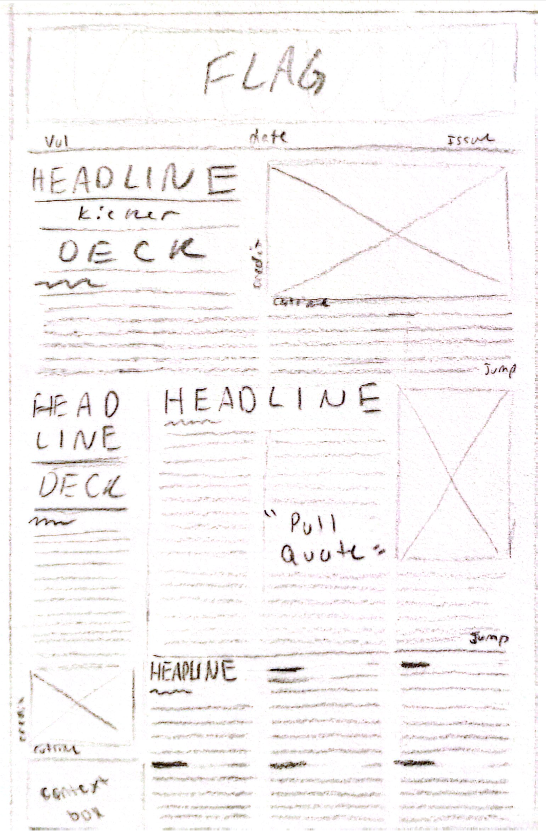
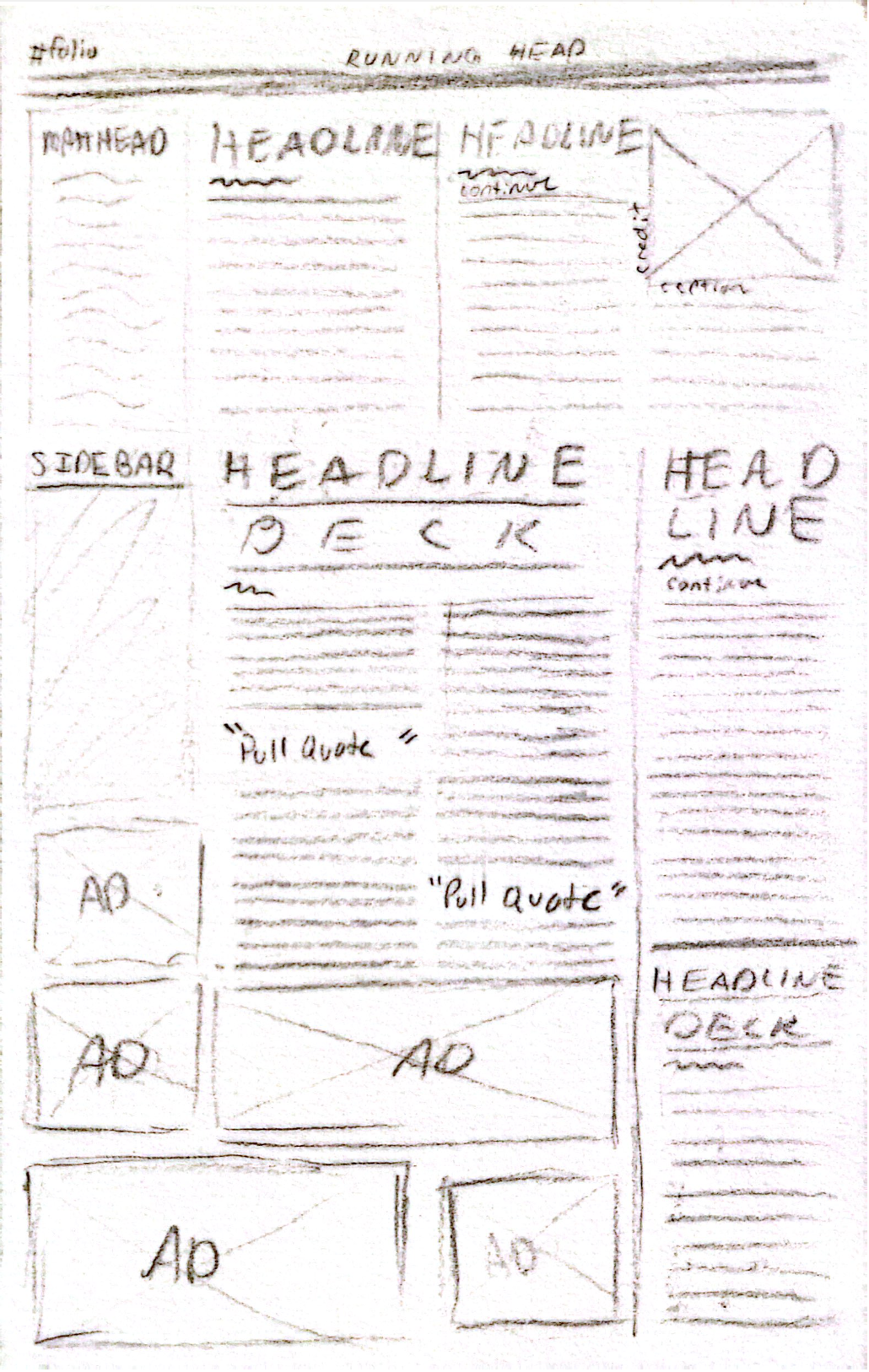
In this project we were tasked to create a newspaper layout. We chose our own margins, headlines, and created our own photos to accompany them by using alcohol markers. The grid layout of my project works well with a four-column design, which allows me to fit in all the necessary elements without feeling overcrowded. The placement of the marker illustrations is balanced diagonally, along with the illustrations decreasing in size as you move down the page. This creates a natural flow for the reader's eye. The illustrations also provide contrast due to the darker reference images used which will grab the reader's attention. Additionally, I used a serif font for headlines and body text and a sans serif font for bylines, captions, and pull quotes, providing variety and engaging the readers visually.
